Home
Planning
Research
Analysis
Publication
E-Portfolio
Review
Marking


Creating a background

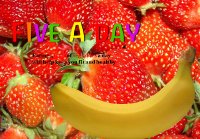
The background will make up most of your publications so it is important to choose wisely. A poor choice of background will ruin the rest of your work. The biggest mistake that most students make is to produce a background which is too "in your face". Consider the two examples below -
Bad example Better example

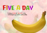
Click on the examples above to see full screen versions. Both examples use strawberries however the one on the right is much fainter. This means that the text is easier to read and the banana is much easier to make out.

The key is to ensure that the background does not stand out too much. It should always be subtle.

Consider the next two examples. The bad examples background is too busy and detracts from the content. Although the background itself is interesting it should never get in the way of the content. The example on the right is much more sutble and allows the content to be viewed easily.
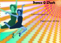
Bad example Better example

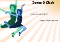
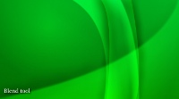
Below are four examples of backgrounds. There are many different styles of backgrounds which you can choose from. Images used as backgrounds can make very interesting backgrounds but you still have to be careful about how it interferes with the content. When you create your background it is important to test out different styles to see how it fits in with what you are tryin

Graident Example Blending Example
Text Background Textured Background


Remember that a background which you may think looks cool may not be the best one! Always think of your auidence and content first.

Resources

Gimp tutorials
Find out what is required


Home
Planning
Research
Analysis
Publication
E-Portfolio
Review
Marking


Creating a background

The background will make up most of your publications so it is important to choose wisely. A poor choice of background will ruin the rest of your work. The biggest mistake that most students make is to produce a background which is too "in your face". Consider the two examples below -

Bad example Better example

Click on the examples above to see full screen versions. Both examples use strawberries however the one on the right is much fainter. This means that the text is easier to read and the banana is much easier to make out.

The key is to ensure that the background does not stand out too much. It should always be subtle.

Consider the next two examples. The bad examples background is too busy and detracts from the content. Although the background itself is interesting it should never get in the way of the content. The example on the right is much more sutble and allows the content to be viewed easily.

Bad example Better example

Below are four examples of backgrounds. There are many different styles of backgrounds which you can choose from. Images used as backgrounds can make very interesting backgrounds but you still have to be careful about how it interferes with the content. When you create your background it is important to test out different styles to see how it fits in with what you are tryin

Graident Example Blending Example
Text Background Textured Background


Remember that a background which you may think looks cool may not be the best one! Always think of your auidence and content first.

Resources

Gimp tutorials