

Step 4 - Create master page
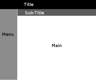
The layout of the website is important. If you look at most websites you should be able to draw out a simple set of boxes which represent the site. The above image shows the classic website layout. Notice that the "main" part is the biggest. The menu is small and tucked away on the left. If there is a layout you like on one of your research websites then feel free to use it.
 |
Do not under estimate the importance of layout! |
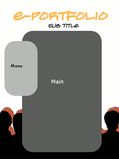 |
The layout is more fluid than the previous example. This layout has a simple white background as well as a image at the bottom. It uses rounded rectangles to make the design feel less formal. This design is still not complete and the gray colours are used as place holders. Once you are happy with a layout you can start adding extra parts such as a menu etc. It is important that you do not add any content to the main section. This will be done later. The master page should be your design minus your content. It is how you want every page to appear. It is well worth doing more than one design and asking your test buddies for advice. This way you can ensure that your website looks as good as you can make it.
|